The Design of the Emacs Logo: Part III

Part III: Gnus Logo Redux
We now continue with the events that ended Part I.
The undiscovered country
The middle of January 2001, brought this email from Gerd:
After all that work, I was disappointed with the rejection.From: Gerd Moellmann To: luis fernandes Subject: [Richard Stallman] Re: New version of Emacs logo Date: 18 Jan 2001 13:41:05 +0100 Luis, I'm afraid RMS doesn't like the image (he looked at both images you sent me.) He likes the idea, but he thinks the image isn't visually clear; he thinks it's hard to recognize the word ``Emacs'' in the image, and it's hard to recognize a gnu in it. Any ideas of what to do?
I was not surprised at the response, though. The logo I had designed obviously embodied too much subtlety, while the requirements called for it to be clear and obvious.
I spent a few days trying to reconcile RMS' objections, to no avail.
The Prime Directive
RMS liked this particular re-designed logo because "GNU" and "Emacs" were clearly visible:From: RMS To: Luis Fernandes Subject: Re: Revised Emacs logos Date: Sat, 20 Jan 2001 21:00:45 -0700 (MST) None of these works for me. Some of them make the gnu clear enough, but finding "Emacs" is a puzzle, assuming you KNOW it is supposed to be there. If you don't know, you would never guess. This is good enough to make a nice amusing picture, but not good enough for a logo. The Emacs logo should scream "Emacs",

One of many re-designs of the Emacs logo attempting to clarify the words, "GNU" and "Emacs". Using Gimp, the text, representing the gnu's shadow, is stretched using control points and layered behind the gnu (22Jan2001). |
I decided to improve on the idea by using the same style in lettering "Emacs", as I had used to draw the gnu. This is what I came up with:
The final version; "Emacs" lettered in the same style as the gnu (1Feb2001). |
The final frontier
It wasn't until the middle of February 2001 that I managed to design a version of the logo that satisfied everyone. It was such a relief! It felt a lot longer than the 5 months it actually took!
Finally, RMS' approval:From: Gerd Moellmann To: RMS Cc: Luis Fernandes Subject: Re: Revised Emacs logos Date: 21 Feb 2001 13:07:22 +0100 Richard Stallman writes: > I like this version pretty well. The gnu and the "Emacs" are both > easily seen. > > Whether to switch to this one is a decision that is up to Gerd. The image is fine with me, if you like it. Luis, could you please make an XPM with transparent background of it, and with size 270x270?
From: RMS
To: Gerd Moellmann
CC: Luis Fernandes
Subject: Re: Revised Emacs logos
Date: Wed, 21 Feb 2001 23:13:02 -0700 (MST)

    The image is fine with me, if you like it.

I will defer to you ;-).

We need legal papers for this image, to use it in Emacs.
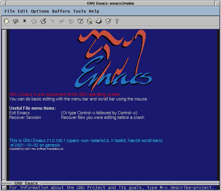 This is what the splash-screen with the final Emacs logo looked like (02Oct2001)0. |
The Appendix provides some technical details about the design of the logo and a couple of variations on the logo that you can download and install.
0Gerd graciously gave me access to the pre-test sources so I could build the pre-test Emacs and see how the logo looked.