The Design of the Emacs Logo: Part I
Part I: The Logo That Wasn't
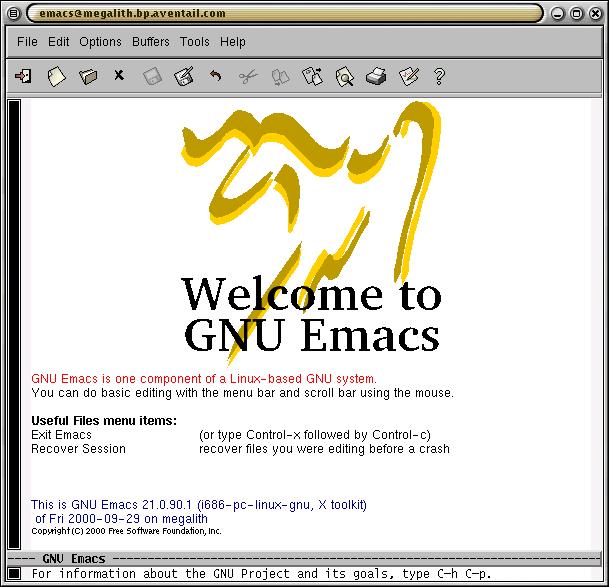 The earliest splash screen, designed by Gerd Moellman, used the Gnus logo with the words "Welcome to GNU Emacs" (29Sep2000)1. |
In early September 2000, I received an email from Gerd Moellman, the primary Emacs developer at the time, inquiring about using the splash-logo I designed for Gnus (the Emacs newsreader cum everything developed by Lars Magne Ingebrigtsen, aka. Larsi) as a splash-logo for Emacs 21, which was still in the pre-test stage at that time:
I've talked with Larsi about this, and he wouldn't mind if we used the Gnus image for the splash screen. We both think that we should ask for your opinion, though. Do you think it's okay?Naturally, I agreed.
However, I thought that having the same splash for both Emacs and Gnus could be confusing and visually wearisome. I asked whether I could try designing another, unique, logo for the Emacs splash screen. There was general agreement, so I began.
The requirements
The only requirement was that the logo clearly say "GNU Emacs".
Initial ideas and sketches
I started by using as many letters as possible, from the words "GNU EMACS", and shaping them into a gnu...
|
The first attempt: the "E" became the gnu's nose; the "M" became the horns; the "N" shaped the left fore-leg while the "G" was the right fore-leg; the "C" and "S" combined in the gnu's rump and rear-leg. |
|
The horns became an "E" rotated counter-clockwise; the "G" became the nose; the "S" became the tail; the "M" became the gnu's rump and rear-leg. |
This looked worse than before! So I attempted something new...
|
Attempted morphing "EMACS" into a gnu. |
|
Tried "GNU", then tried "GNU EMACS". |
Something takes shape...
|
Instead of using both "GNU" and "EMACS", I shaped "EMACS" into a gnu. The "E" became the Gnu's nose; the "M" formed the right foreleg and the "ACS" formed the rest of the body; finally, the "U" represented the horns. |
|
Adding fore-legs created a 3-legged alien animal. |
This iteration streamlined the shape of the gnu...
|
Stretching the lines, the standing gnu became a leaping gnu; the "M" forming the left fore-leg. |
Finally, a few more enhancements...
|
The "S" became the tail/rear-leg. |
...and voilà! The first release...
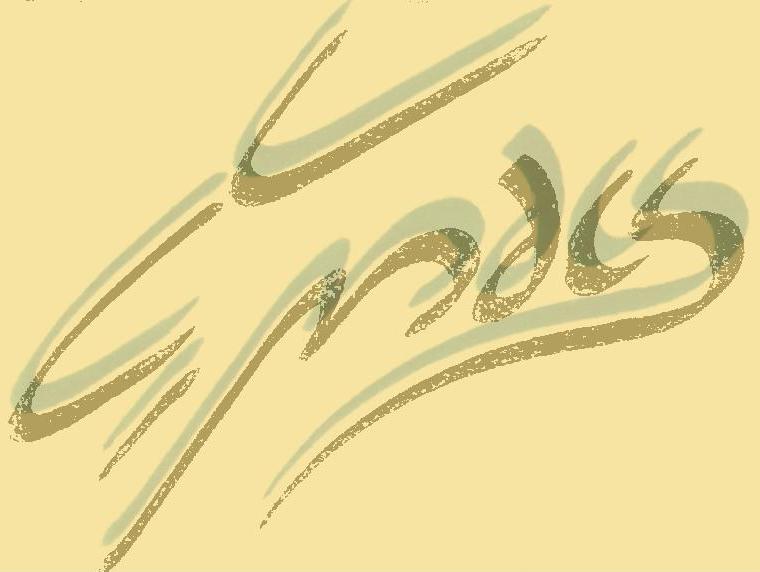 The word "EMACS" shaped into a gnu. This image was posted to the Emacs pre-test mailing list (13Dec2000).
|
Eli Zaretskii was the first to note that it may not be obvious to the casual observer, that the logo spells "GNU Emacs".
Per Abrahamsen agreed, with some reservations:
You are most likely right, given that few users understand that the current Emacs 21 pretest logo spell "GNUS" in fancy script.As did Francis J. Wright:I think the "GNUS" logo looks better, but the "GNU Emacs" logo make more sense as a logo for GNU Emacs. Also, it look like some exotic character set, which is appropriate for a multilingual editor.
I thought it was very clever, once I figured out it was the word Emacs written in the shape of a GNU. (Well, I assume that's what a GNU looks like, we don't get too many around here.) It might just about remain intelligible as an icon. However, it's not immediately obvious that the icon I currently use is the head of a GNU, either. Nevertheless, I know immediately that it is my shortcut to GNU Emacs. So, I don't think it matters what the logo really is, but if there's a neat joke in there when you look closely then so much the better. I think this one would make a nice change, which is perhaps appropriate for a new major version of Emacs.I also hinted that I had a variant that could be used as a replacement for the XEmacs logo. After Hrvoje Niksic asked to see my logo, I posted this on Dec. 14, 2000...
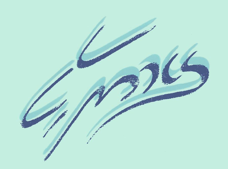 XEmacs variant of the Emacs logo; the "A" and "C" combined to form an "X". |
On eve of the new millennium, I sent Gerd the following email:
I received about 4 email comments— all positive. I looked through the web logs and counted 185 hits for the emacs logo and 120 for the xemacs logo. The first hit came 1:39s after I posted the announcement on emacs-pretesters (it looks like you're doing all the work and the rest of them are just sitting around :-).After some contemplation, I find the xemacs version (pretest-x01.jpg) the nicer of the two (it's more refined and subtler) and if the xemacs camp also chooses it (the murmurs I heard indicated that) then we are one more step closer to The One True Editor.
And let's not forget the fund raising for the GNU Project that would be possible with Emacs logo T-shirts, mugs, caps (and perhaps action figures).
Happy new year!
In part II, the story jumps back in time to 1995 and tells how the Gnus logo came to be developed.
1Emacs was first able to display inline images on April 30, 1998. Support for the splash-logo at startup was added September 19, 2000.